

At Alice Benjamin Interiors, I approach each home as a canvas for color that speaks to your story and lifestyle. Color is more than decoration; it influences how you feel, how you move through a space, and the way moments unfold within it. By applying principles of interior color psychology, I guide clients in selecting refined color palettes that bring balance, depth, and subtle emotion to each room.
In curated interiors, even quiet, understated hues carry meaning, shaping atmosphere and memory while reflecting personality. From the soft layering of neutrals to the thoughtful integration of accent tones, each choice contributes to a home that feels poised, deliberate, and personal. Through careful attention to light, texture, and spatial flow, I help transform spaces into environments that support comfort, clarity, and connection, creating interiors that resonate quietly yet powerfully with those who inhabit them.
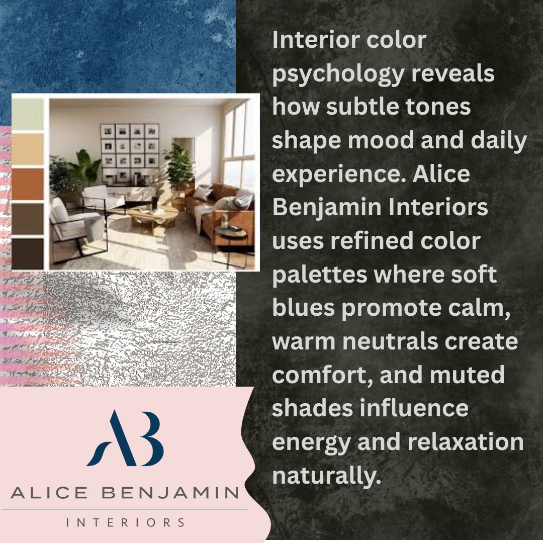
The colors you select for your home shape how you feel and interact within each room. They can bring calm, energy, focus, or warmth, influencing both mood and daily activity.
Color directly influences emotions and cognitive responses. Blues and greens invite a sense of calm and help maintain focus, while soft, warm neutrals create a grounded and balanced atmosphere.
Even subtle variations, like a muted taupe or a pale sage, can gently alter how you feel, affecting everything from concentration to relaxation. In curated interiors, these choices are carefully considered to guide mood, create harmony, and make spaces feel more connected to your personality and lifestyle.
Lighting changes how colors appear in a room. A wall painted in soft beige may radiate warmth in morning sunlight but take on a cooler tone under evening lighting.
The size of the space also affects perception, as compact rooms can feel open and airy with light, muted shades, while expansive areas can accommodate richer tones without overwhelming the senses. Observing how light interacts with your colors allows you to shape an environment that responds naturally to different times of day and the way you live.
Different rooms require tailored color considerations. In kitchens, soft warm accents can subtly support energy and movement, making daily tasks feel fluid. Bedrooms are well-suited to muted, poised tones that help your mind transition to rest, while bathrooms benefit from layered neutrals and textures that create a serene yet refined environment.
Through careful color choices, each room can communicate its purpose while reflecting personal taste and the way you move through your home. At Alice Benjamin Interiors, I use these principles of interior color psychology to guide each project, selecting colors that resonate with both the function of the space and the personality of the client.
Creating a refined palette requires thoughtful attention to how colors interact with each other and the environment. Each choice contributes to a cohesive and deliberate atmosphere that feels personal and inviting.
A curated palette starts with intentional base colors. Begin by identifying a primary neutral that will serve as the foundation of your space. Layering complementary shades builds a visual narrative, guiding how your eyes move through the room. For example, muted ochre combined with soft ivory and a subtle gray foundation creates a sense of timelessness. Each shade supports the others, producing a flow that feels balanced and poised rather than fragmented or arbitrary.
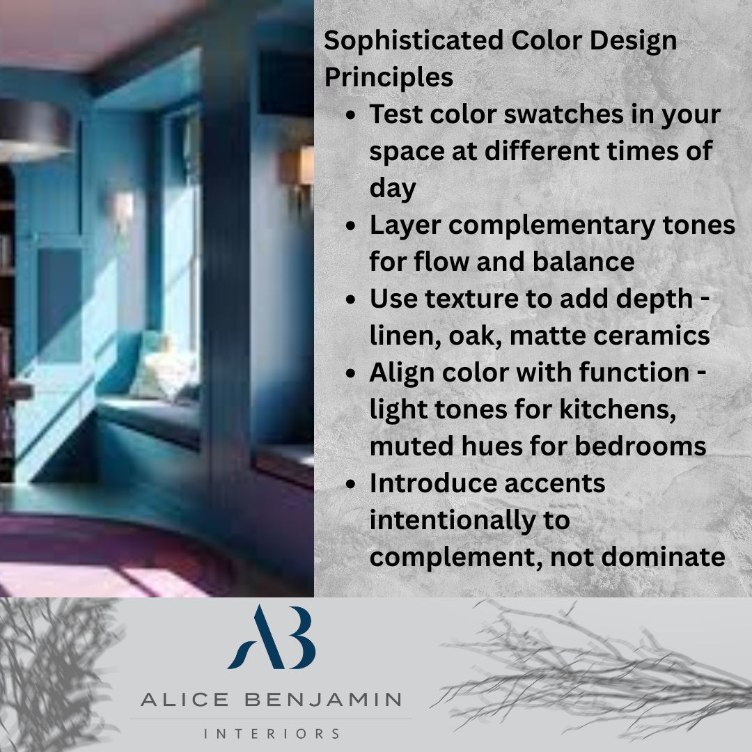
Texture and tone deepen the palette’s effect. Neutrals alone can appear flat, but pairing them with varied textures adds dimension and tactility. Linen drapes, natural oak furniture, and matte ceramics interact with pigments in ways that enhance warmth and depth. Accent hues, applied thoughtfully through accessories or architectural details, create subtle interest without dominating the overall composition. This approach transforms color from a simple visual element into an experience that engages the senses.
Moderation is key in color contrasts. Too much contrast can feel harsh, while too little may appear monotonous. Introducing soft tonal variations adds visual layers and depth. For instance, pale beige walls paired with slightly darker upholstery create distinction while maintaining a calm, collected environment. This balance allows you to explore richness in color without overwhelming the eye or disrupting the space’s flow.
Personal and cultural elements guide palette choices. Your heritage, travels, or memories can subtly inform color selection. A Parisian-inspired home might favor muted grays and gentle blues, while a space honoring family traditions may incorporate warm ochres or terracotta tones. These choices anchor the design in lived experience, giving rooms a sense of authenticity and resonance that reflects your story.
At Alice Benjamin Interiors, I guide clients through the process of defining refined color palettes that feel intentional, grounded, and deeply personal. Each palette is crafted to reflect lifestyle, personality, and the unique character of the home, creating spaces that are both poised and welcoming.
The way color is layered and applied can transform a house into a home that feels thoughtfully composed. Each choice, from subtle tones to accent details, contributes to a living environment that resonates with personality and lifestyle.
Layering creates dimensionality in a room. A gentle beige wall paired with a textured linen curtain and a slightly darker rug allows the eye to move naturally across the space. This method creates subtle variation and visual interest, giving rooms a sense of depth without drawing attention away from the overall design.
Combining different materials, such as soft textiles with natural wood or ceramic finishes, helps bring a tactile richness that invites interaction and comfort. Layering also allows you to introduce a palette gradually, building complexity and sophistication in a way that feels deliberate and cohesive.
Accents should be subtle and intentional. A single muted ochre pillow against neutral upholstery or a delicate artwork on a soft-toned wall can transform a corner without overwhelming it.
Selecting accents in harmony with the base palette maintains serenity while offering focal points that support rather than distract from the room’s atmosphere. Attention to proportion, scale, and placement of accent pieces guarantees that each element adds to the overall cohesion, keeping the space refined and poised.
Color supports everyday activities. In kitchens, reflective tones brighten surfaces and contribute to clarity for cooking or gathering. In lounges, warm neutral shades foster conversation and create a sense of ease.
Observing how light moves across the space and how people interact with different areas informs subtle adjustments in tone or finish. Each layer and accent responds to activity, circulation, and natural sightlines, creating interiors that feel both functional and comfortable while remaining sophisticated.
By combining layered tones, subtle accents, and a thoughtful relationship to movement, Alice Benjamin Interiors crafts spaces that embody color in curated interiors. Every detail is considered, creating interiors that feel layered, personal, and visually harmonious.
Choosing and applying a refined color palette involves more than selecting shades from a chart. Small differences in hue, texture, or light can transform the way a space feels, so taking deliberate steps will help you shape a room that resonates.
Swatches and simulations provide accuracy before final decisions. By working with physical samples, you can see how fabrics, paint, and finishes interact in the actual space. Digital previews complement this process, allowing you to test combinations across walls, furniture, and décor.
This approach helps you visualize the final composition, reducing guesswork and giving confidence that the colors work together as needed. Experimenting with these tools lets you explore multiple options without committing to a single palette prematurely, and it highlights subtle differences that may otherwise go unnoticed.
Colors shift with lighting conditions. Natural and artificial light can change the perception of hue and depth. A soft green may feel serene in daylight but take on a warmer tone under evening lighting, while a pale gray may appear cooler near a large window and richer against interior lamps.
Observing the palette throughout the day allows you to see how each tone behaves in different areas and makes sure that transitions between rooms feel cohesive and balanced. This method also helps in arranging materials and furnishings in ways that complement the light rather than conflict with it.
Palettes should adapt subtly over time. A home is a living environment, and colors can grow with your lifestyle and interests. Introducing new textures, artwork, or furniture allows the space to remain dynamic without losing harmony. This evolution encourages spaces to feel consistently layered and thoughtful, rather than fixed or static.
By approaching color as something that develops, you can maintain interiors that feel refined, deliberate, and aligned with personal rhythms, creating a home that continues to inspire over the years.
Bringing a palette from concept to a lived-in space requires careful attention to detail and a sensitivity to the rhythms of daily life. Each choice of color can shape how a room feels, interacts with light, and supports the activities within it.
I provide personalized consultations to align colors with lifestyle. In these sessions, I work closely with you to explore how each room is used, how natural and artificial light affects surfaces, and how your personal story can be expressed through color.
Together, we examine textures, finishes, and subtle undertones to create palettes that feel deliberate yet approachable. By observing the nuances of your space and preferences, I help bring forward combinations that harmonize with your environment while evoking the emotional atmosphere you want in each room.
Refined color choices convey identity. Every client has a distinct way of living, and the colors in their home should reflect that individuality. A collector of contemporary art may favor soft, neutral walls that allow artwork to stand out, whereas a family-focused home benefits from warm, muted tones that balance practicality and serenity.
I consider patterns of daily activity, furniture placement, and personal tastes to craft refined color palettes that feel authentic and expressive without being overwhelming.
Color decisions extend beyond walls. The choices you make for upholstery, rugs, artwork, and even trim work should work together with your palette rather than compete with it.
A muted teal sofa, for instance, can bring cohesion when paired with natural oak furniture and cream walls, creating spaces where every element supports the visual story. This thoughtful coordination allows color in curated interiors to feel balanced and intentional, transforming each room into a unified composition.
Intentional palettes create emotional resonance. Color has the power to stir memories, suggest tranquility, or energize a space without drawing attention to itself. By layering soft tones and carefully chosen accent hues, I help you create interiors that feel personal and timeless. Each palette can subtly reference cultural ties or meaningful experiences, producing rooms that invite reflection, comfort, and quiet sophistication.
At Alice Benjamin Interiors, based in Chicago, Illinois, I approach each project with these principles in mind, bringing your vision to life through color that feels deliberate, personal, and aligned with the way you live.
If you are ready to experience the impact of thoughtfully chosen colors, I invite you to connect with me at Alice Benjamin Interiors. Together, we can craft refined palettes that reflect your lifestyle, personality, and the way you live in your home. Each consultation is tailored to explore your space, consider lighting and textures, and translate your story into a cohesive, deliberate environment.
Reach out today to begin the journey of creating interiors that feel personal, poised, and aligned with your vision. Call (872) 274-2724 or email admin@alicebenjamininteriors.com to schedule a consultation. Let’s bring color to life in your home with intention, depth, and quiet sophistication.
